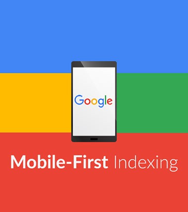
In 2016 the volume of mobile search exceeded the amount of search from the desktop and amounted to 56%. From that moment on, the era of the transition to Mobile First Index began. With the help of this technology websites are primarily ranked for the quality of their mobile version.
Already, the volume of mobile search in some niches, such as medicine, clothing, cafes/bars/restaurants and many others, has gone over 80%.
We suggest you keep up with Mobile market trends and fully prepare your web resource for the Mobile era with the help of mobile site optimization tools.
Our services

In the first place, this implies a rethinking of User Experience by users, taking into account the limitations imposed by mobile devices and the additional functions they possess.
As practice shows, more than 50% of the elements that are suitable for the desktop version of the site do not work at all in the mobile. The introduction of usability audit will help the user to proceed his way from the login page to the conversion action with maximum comfort.

To rank in the TOP 3 search engines in the era of Mobile First Index it is necessary that the site fully complies with the requirement of Mobile Friendly.
As part of the site’s technical audit, a full assessment of all pages of the site is carried out to fulfill this requirement.
Also, an assessment is made of the speed of the mobile version of the site on 3G and 4G connections, the adaptability of the layout, the weight and format of the images, the readability of the text from mobile devices and a number of factors affecting the ranking of the mobile version of the site.
The implementation of all these recommendations will significantly bring your website closer to the top positions in the search results.
The two most popular technologies to bring your site to the Mobile First world are: “Rubber Layout” and “Adaptive Design”.
Rubber layout is a quick solution, when all elements of the current desktop version of the site are placed in “blocks”. These blocks stretch and taper, go lower or higher depending on the screen resolution. Thus, the entire functionality of the site is completely moved to a mobile device. It's fast, however not everything that is on the desktop is needed on a mobile version.
Adaptive design is a type of design, when for different screen resolutions and even for different device models a specialist draws separated design. It's longer than the “rubber layout” but it gives more options for customizing the site. So, it helps improve the user experience on a mobile device and further A/B testing the functionality of the mobile version.
It's your choice what to apply. We will help you implement the chosen solution as quickly and efficiently as possible.
This block includes the whole complex of works, starting from technical audit and obtaining the Mobile Friendly status, ending with the design and adaptation of content for a mobile audience.
Everything matters, starting from which navigation blocks will move from the desktop version and ending with what part of the content should be shown to the user and which to hide under “Read More”.
How to correctly adapt materials on the site? Because in the visible part of the content there should be information that has the maximum weight for ranking the site. And everything useful but not such significant should also be on the page but don't degrade the User Experience.
We will be happy to help you pass this path and enter the Mobile First era.

Connecting AMP technology to a site allows you to get pages that load on mobile devices in less than 1 second.
This is a quick way to get an increase in mobile traffic, if you understand that improving your mobile templates will take a lot of time and resources of design and development teams.
This technology still has limitations. Nevertheless, it's actively developing and in the near future all these limitations will be overcome. Due to limitations, it is not used on pages that require JavaScript. For example, on pages where there is a “Add to cart” button or some other code that runs right on the page, without reloading it. Therefore, most often AMP is used for information pages, product pages without the possibility of purchase and catalogs in which you can see the product, but its purchase is already done directly from the item card.
AMP page performs the role of "bait" for the user. When you go to the site from the Mobile issue, the user makes his first contact with the AMP page, but when he starts clicking on the links, his whole further journey follows the usual mobile version of the site. The user gets the opportunity to quickly get an answer to his question and understand whether he likes your website or not. And, if the content and the quality of the website satisfy him, he will continue his journey through it.
For effective and rapid implementation of this technology on your website, we are ready to develop the design of the main AMP pages, provide all the recommendations for connecting to the development team and monitor the implementation of AMP.